Inlining a full <path> for every icon bloats your HTML and ships the same geometry on every page. An SVG sprite fixes both: bundle your icons into one cacheable file, then drop in each icon as a two-line <svg><use> reference that recolors itself from CSS.
This guide takes icons exported from Axialis IconVectors, builds a sprite with the svg-sprite CLI, and wires up theming through currentColor. Allow roughly ten minutes.
Why an SVG sprite?
- One request, long cache — the browser fetches dozens of icons in a single file and reuses it across every page that references it.
- Theming from CSS — when icons paint with
currentColor, each instance takes thecolorof its parent, so dark mode and button states need no extra assets. - Smaller HTML — every icon collapses to a
<svg><use>pair instead of a repeated wall of path data.
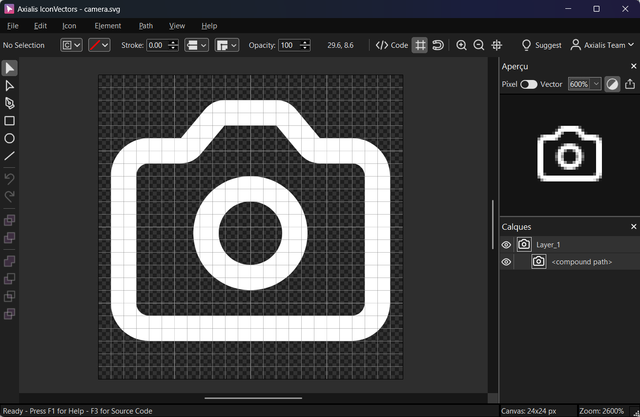
1 - Export clean SVGs from IconVectors
Open or draw your icons (File → Open… (Ctrl+O) or New Icon (Ctrl+N)), then make them themeable by setting Fill and Stroke to currentColor so each instance can be recolored from CSS. Verify the markup with View → Source Code (F3), then ship lean files with File → Export → Export Minified.
2 - Organize your exported SVGs
Put every exported icon in one folder, such as icons/. The CLI turns each file name into a symbol ID, so name files the way you want to reference them.
project/
  icons/
    camera.svg
    check.svg
    user.svg
    ...
3 - Build the sprite with svg-sprite
The svg-sprite CLI generates a single sprite.svg that exposes each icon as a <symbol>. Install it once per project:
npm i -D svg-sprite
# or run ad-hoc
npx svg-sprite --version
Save a minimal config as sprite.config.json. The generator below prefixes each symbol ID with icon-, and turning off the XML and doctype declarations keeps the output inlinable:
{
  "mode": {
    "symbol": {
      "dest": "dist",
      "sprite": "sprite.svg"
    }
  },
  "shape": {
    "id": { "separator": "-", "generator": "icon-%s" }
  },
  "svg": {
    "xmlDeclaration": false,
    "doctypeDeclaration": false
  }
}
Generate the sprite:
npx svg-sprite --config sprite.config.json icons/*.svg
# -> creates dist/sprite.svg with <symbol id="icon-camera">, <symbol id="icon-check">, ...
4 - Reference icons with <use>
Point <use> at a symbol inside the external sprite file. Each instance sets its own size and color:
<!-- External sprite usage -->
<svg width="24" height="24" class="text-slate-700" aria-hidden="true">
  <use href="/dist/sprite.svg#icon-camera" />
</svg>

<svg width="20" height="20" class="text-emerald-600" aria-hidden="true">
  <use href="/dist/sprite.svg#icon-check" />
</svg>
To skip the extra request entirely, paste the generated sprite.svg near the top of the page and reference it with a same-document fragment:
<!-- Paste dist/sprite.svg somewhere near the top of the page -->
<svg xmlns="http://www.w3.org/2000/svg" style="display:none">
  <symbol id="icon-user" viewBox="0 0 24 24">…</symbol>
</svg>
5 - Theme instances with CSS
Because the icon paths paint with currentColor, each instance inherits its color from CSS — one symbol covers light mode, dark mode, and hover states:
.btn-primary .icon { color: #2563eb; }
[data-theme="dark"] .btn-primary .icon { color: #93c5fd; }
<button class="btn-primary">
<svg class="icon" width="20" height="20" aria-hidden="true">
<use href="/dist/sprite.svg#icon-user" />
</svg> Save
</button>Notes & troubleshooting
- Icon won't change color? The path is probably hard-coded to a fixed fill. Set fills and strokes to
currentColorin IconVectors before export, then confirm in View → Source Code (F3). - Wrong symbol IDs? The CLI derives IDs from file names. Adjust the
generatorin the config or rename the source files (for exampleicon-camera.svgbecomes#icon-camera). - Fragment not resolving? When you use an external sprite, the
hrefmust point at the served URL (for example/dist/sprite.svg#icon-name); watch for a bundler or dev-server base path that rewrites it. - Accessibility — mark decorative icons
aria-hidden="true"; for meaningful icons addrole="img"and anaria-label.
Related guides
- Build an SVG Sprite for Vite, React & Vue
- How to Use SVG Icons in Web Applications
- Native SVG Icons (use case)
Start Making SVG Icons Today with IconVectors
Download the fully-functional 30‑Day Free Trial and unlock your icon design workflow.
Version 1.70 for Windows and macOS