An inline SVG icon ships with no accessible name by default: screen readers either skip an informative icon entirely or read decorative ornaments as noise. This reference shows the exact markup that fixes both cases — aria-hidden to hide decoration, role="img" with <title>/<desc> or aria-label to name meaning — plus how to export a clean, currentColor SVG from IconVectors that drops straight into this markup.
Decorative vs informative icons
- Decorative: does not add information (pure ornament). Hide it from the accessibility tree.
- Informative: conveys meaning not provided elsewhere (status, action, warning). Expose it with a clear accessible name.
Export a clean, themable SVG from IconVectors
- Open or create your icon:
- File → Open… (Ctrl+O) or New Icon (Ctrl+N).
- Prefer a simple path-based icon; set fills/strokes to
currentColorfor easy theming.
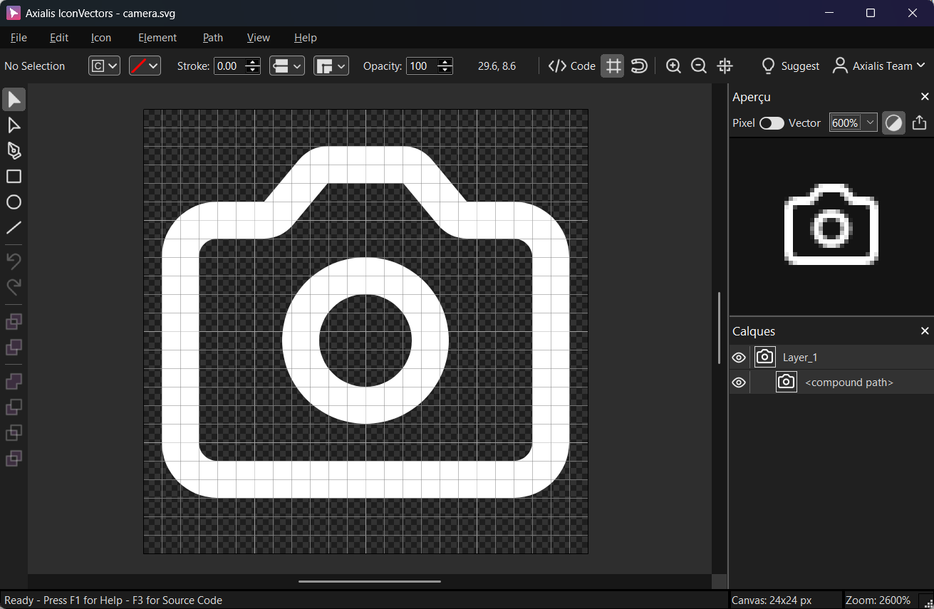
Export a minified SVG via File → Export → Export Minified (Shift+Ctrl+M). Use View → Source Code (F3) to verify viewBoxandcurrentColor.
Pattern 1 — Decorative SVG (hide from AT)
For purely visual icons, remove them from the accessibility tree so screen readers don't announce noise.
<!-- Decorative icon next to text -->
<p>
  <svg aria-hidden="true" focusable="false" width="16" height="16" viewBox="0 0 24 24">
    <path d="M4 12 9 17 20 6" fill="none" stroke="currentColor" stroke-width="2"/>
  </svg>
  Settings updated
</p>- Use
aria-hidden="true"so the icon is ignored by assistive tech. - Add
focusable="false"to keep the SVG out of the tab order in legacy/edge cases.
Pattern 2 — Informative inline SVG with role & label
When the icon conveys meaning, give it an accessible name (short) and an optional long description.
<!-- Informative icon announced as "Warning" -->
<svg role="img" aria-labelledby="warn-title warn-desc" width="20" height="20"
     viewBox="0 0 24 24" xmlns="http://www.w3.org/2000/svg">
  <title id="warn-title">Warning</title>
  <desc id="warn-desc">Triangle with exclamation mark</desc>
  <path d="M12 3 2 21h20L12 3zm0 6v6m0 4h.01" fill="none" stroke="currentColor" stroke-width="2"/>
</svg>- Use
role="img"on the outer<svg>and reference<title>(short name) and optional<desc>viaaria-labelledby. - Keep the name concise. If nearby text already names the icon, you can reference that element's
idinstead.
Pattern 3 — Icon-only buttons/links
Interactive controls need an accessible name. Put the label on the button/link and hide the icon.
<button type="button" aria-label="Close dialog" class="icon-btn">
  <svg aria-hidden="true" focusable="false" width="20" height="20" viewBox="0 0 24 24">
    <path d="M6 6 18 18M6 18 18 6" fill="none" stroke="currentColor" stroke-width="2"/>
  </svg>
</button>- The focus remains on the button/link; the SVG should not be focusable.
- Prefer
aria-labelor visible text (e.g., "Close") for the control's accessible name.
Pattern 4 — External SVG files via <img>
When using <img src="icon.svg">, supply the meaning using alt. Use an empty alt for decorative images.
<!-- Informative: announced as "Download" -->
<img src="/icons/download.svg" width="20" height="20" alt="Download">

<!-- Decorative: ignored by AT -->
<img src="/icons/starburst.svg" width="20" height="20" alt="">
Pattern 5 — SVG sprites with <use>
For sprite references, the <svg> wrapper gets the ARIA.
<!-- Decorative sprite use -->
<svg aria-hidden="true" focusable="false" class="icon"><use href="#icon-check" /></svg>

<!-- Informative sprite use -->
<svg role="img" aria-label="New notifications" class="icon"><use href="#icon-bell" /></svg>
Keyboard focus rules (quick recap)
- Icons themselves are not focusable unless interactive. Keep focus on the control (button/link).
- Use
focusable="false"on inline SVGs to avoid stray focus in legacy engines; don't addtabindexto decorative icons.
Checklist
- Decorative →
aria-hidden="true",focusable="false". - Informative →
role="img"+ label (aria-labelor<title>/<desc>witharia-labelledby). - Icon-only controls → put the name on the control, hide the icon.
- Export minified from IconVectors and use
currentColorfor flexible theming.
Related guides
Start Making SVG Icons Today with IconVectors
Download the fully-functional 30‑Day Free Trial and unlock your icon design workflow.
Version 1.70 for Windows and macOS