Dropping raw <img> tags or icon-font dependencies into a Vue 3 app blocks the two things you actually want: CSS theming and tree-shaking. Import each SVG as a real Vue component instead and you get both — the icon inherits text color through currentColor, and unused icons drop out of the bundle.
This guide wires up vite-svg-loader in a Vite project, exports a clean SVG from IconVectors, adds the TypeScript declarations Vue needs, and shows both import styles (default and the ?component query). Total time is a few minutes; no runtime icon library required.
Export a clean, themable SVG from IconVectors
- Open or create your icon:
- File → Open… (Ctrl+O) or New Icon (Ctrl+N).
- Set fills/strokes to
currentColorso the icon inherits CSS/text color in Vue.
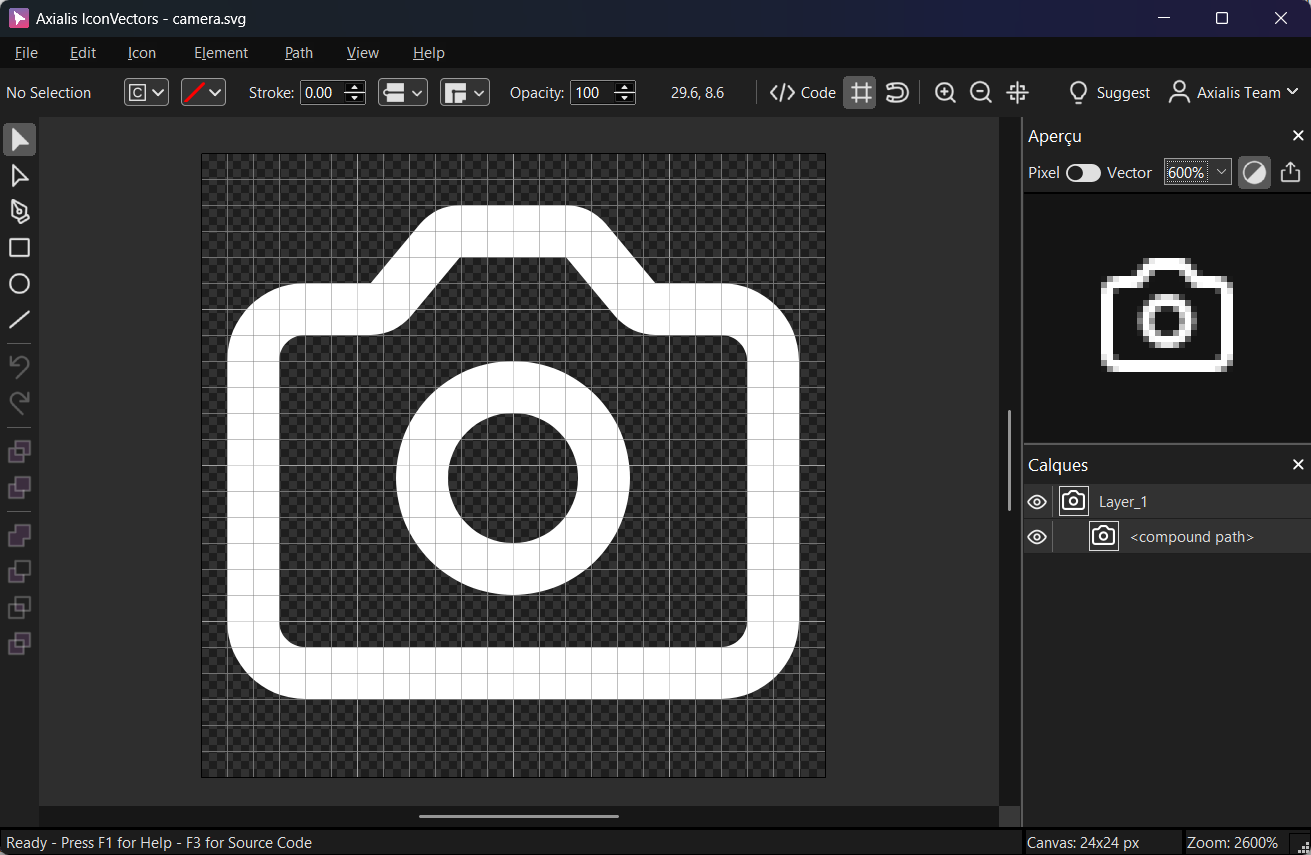
Export a minified SVG via File → Export → Export Minified (Shift+Ctrl+M) to strip metadata and keep a clean viewBox.
Install & configure vite-svg-loader
- Install
npm i -D vite-svg-loader # or: pnpm add -D vite-svg-loader # or: yarn add -D vite-svg-loader - Configure
vite.config.tsimport { defineConfig } from 'vite' import vue from '@vitejs/plugin-vue' import svgLoader from 'vite-svg-loader' export default defineConfig({ plugins: [ vue(), svgLoader({ // Use SVGO and keep viewBox; strip width/height so CSS controls size svgo: true, svgoConfig: { plugins: [ { name: 'preset-default', params: { overrides: { removeViewBox: false } } }, 'removeDimensions', 'prefixIds' // avoid ID collisions if your SVG uses ids/gradients ] }, defaultImport: 'component' // allow: import Icon from './icon.svg' }) ] }) - Add TypeScript types (project root)
// env.d.ts
/// <reference types="vite/client" />
declare module '*.svg' {
  import type { DefineComponent } from 'vue'
  const component: DefineComponent
  export default component
}
declare module '*.svg?component' {
  import type { DefineComponent } from 'vue'
  const component: DefineComponent
  export default component
}
Import SVG as a Vue component & theme with CSS
- Inline component import
<!-- src/components/SaveButton.vue --> <script setup lang="ts"> import CheckIcon from '@/icons/check.svg' // because defaultImport: 'component' </script> <template> <button class="inline-flex items-center gap-2 text-emerald-600 hover:text-emerald-700"> <CheckIcon class="w-5 h-5" aria-hidden="true" /> Save </button> </template>Theming: Because your SVG uses
currentColor, the icon adopts the button's text color. Change color with a class or inline style (e.g.,style="color:#2563eb"). - Alternate import with query
<script setup lang="ts">
import CheckIcon from '@/icons/check.svg?component'
</script>
Project structure & tree-shaking
- Import icons where used (e.g.,
import Icon from '@/icons/x.svg') so unused files aren't bundled. - Barrels (
icons/index.ts) are fine if they don't add side effects. Keep them pure to preserve tree-shaking. - IDs/gradients — if SVGs contain
id=,clipPath, or gradients, keep prefixIds enabled to avoid collisions when multiple icons are on the page.
Troubleshooting
- Icon won't change color — ensure your SVG paths use
fill="currentColor"/stroke="currentColor"instead of hard-coded hex colors. - "Cannot find module '*.svg'" — add the TypeScript module declarations shown above.
- ViewBox missing — keep
viewBoxby disabling SVGO'sremoveViewBoxand removing explicit width/height (done in the config).
With this setup, every SVG you export from IconVectors becomes a typed, themable Vue component that ships only when it is imported. Start from clean, currentColor-ready paths and the loader handles the rest at build time.
Related guides
Start Making SVG Icons Today with IconVectors
Download the fully-functional 30‑Day Free Trial and unlock your icon design workflow.
Version 1.70 for Windows and macOS