Importing raw .svg files into a React app usually means wiring up SVGR or vite-plugin-svgr, then losing your editor's exact paths to a build step. IconVectors skips that: it exports each icon as a typed React component you paste straight into your project, with React.SVGProps<SVGSVGElement> props, a forwardRef for refs, an optional accessible label, and currentColor for CSS theming.
This guide covers the export steps in IconVectors, a production-ready component template, and the React-specific patterns for accessibility, theming, and tree-shaking. If you'd rather keep .svg files and let your bundler generate components, the companion vite-plugin-svgr tutorial shows that route instead.
When to choose React TypeScript
- You want type-safe components that accept standard
SVGProps(className,width,height,style, ARIA, etc.). - You prefer tree-shakable, named exports and easy reuse across apps/libraries.
- You need themable icons via CSS (
currentColor) and predictable scaling with a consistentviewBox.
Draw, Import or Trace your icon
- Start by drawing directly in IconVectors. Use the shape, pen, and path tools to build icons on a pixel-perfect grid (16/20/24/32 px). Align strokes to whole pixels for maximum sharpness at small sizes.
- File → Place lets you import an existing SVG file into your current document — useful for reusing symbols or assets from Figma, Illustrator, or Inkscape.
- File → Place and Trace Bitmap inserts a bitmap image (PNG, JPG, BMP, etc.) and converts it to vector paths. The tracing is optimized for monochrome bitmaps like glyphs or scanned sketches; refine the paths after tracing.
- You can also Copy/Paste vector content from external tools. IconVectors interprets SVG data in the clipboard and adds it to the canvas.
- Or draw from scratch using rectangles, ellipses, lines, freeform pen, path editing, and boolean operations for full control.
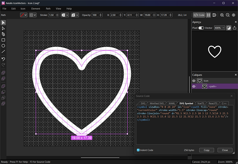
Export a React TypeScript component from IconVectors
- Design on a consistent grid (e.g., 24×24). Keep strokes aligned to whole pixels.
- Set theming strategy: for single-color icons, prefer
currentColoronfillorstrokeso CSS can control color. - Open the code viewer (F3) and switch to the React (TS) tab.
- Copy the generated component (or use Export) and save it to your project, e.g.,
icons/HeartIcon.tsx.
Component template (typed & forwardRef)
import * as React from "react";

export type IconProps = React.SVGProps<SVGSVGElement> & {
  /** Optional accessible label; if omitted, icon is decorative */
  title?: string;
  /** Optional size in px (applies to width/height) */
  size?: number | string;
};

export const HeartIcon = React.forwardRef<SVGSVGElement, IconProps>(
  function HeartIcon({ title, size = 24, ...props }, ref) {
    const aria = title
      ? { role: "img", "aria-label": title }
      : { "aria-hidden": "true" as const };

    return (
      <svg
        ref={ref}
        viewBox="0 0 24 24"
        width={size}
        height={size}
        {...aria}
        {...props}
      >
        <path
          fill="none"
          stroke="currentColor"
          strokeWidth="1"
          strokeLinecap="round"
          strokeLinejoin="round"
          d="M2.5 9C2.5 2.5 10 3 12 7.5C14 3 21.5 2.5 21.5 9C21.5 15.4 12 21.5 12 21.5C12 21.5 2.5 15.6 2.5 9z"
        />
      </svg>
    );
  }
);
Usage examples
import { HeartIcon } from "./icons/HeartIcon";

// 1) Decorative icon (screen readers ignore)
<HeartIcon className="h-5 w-5 text-rose-600" aria-hidden="true" />

// 2) Informative icon with label
<HeartIcon className="h-5 w-5" title="Favorite" />

// 3) Set size via prop or CSS
<HeartIcon size={20} style={{ color: "#16a34a" }} />
Using an SVG sprite in React (alternative)
If you maintain a global sprite, reference symbols with <use href="…"/> (modern React supports href):
// sprite definition lives once in your app (e.g., in _app.tsx or index.html)
/*
<svg style="display:none">
  <symbol id="icon-heart-24" viewBox="0 0 24 24">
    <path fill="none" stroke="currentColor" stroke-width="1" stroke-linecap="round" stroke-linejoin="round"
          d="M2.5 9C2.5 2.5 10 3 12 7.5C14 3 21.5 2.5 21.5 9C21.5 15.4 12 21.5 12 21.5C12 21.5 2.5 15.6 2.5 9z"/>
  </symbol>
</svg>
*/

export function HeartIconSprite(props: React.SVGProps<SVGSVGElement>) {
  return (
    <svg width={24} height={24} aria-hidden="true" {...props}>
      <use href="#icon-heart-24" fill="currentColor" />
    </svg>
  );
}
Accessibility checklist
- Decorative: add
aria-hidden="true"(or omittitlein the template above). - Informative: provide a
title(addsrole="img"+aria-labelautomatically in the example). - Prefer inline components or sprites over
<img src="icon.svg">when you need ARIA and CSS control.
Theming with currentColor
Keep fills or strokes on the main shape set to currentColor so icons inherit text color from CSS (utility classes or variables). For fixed accents, use hard-coded colors on secondary paths.
.btn-icon { color: #2563eb; }
[data-theme="dark"] .btn-icon { color: #93c5fd; }
<button className="btn-icon inline-flex items-center gap-2">
<HeartIcon size={20} aria-hidden="true" /> Save
</button>Performance & packaging tips
- Named exports (one file per icon) improve tree-shaking. Avoid re-exporting everything from a single
index.tswithexport *unless your bundler can still shake it. - Consistent
viewBox(e.g.,0 0 24 24) keeps sizing predictable across your set. - Minify when shipping: if you don't need readable code, use IconVectors' Minified SVG export for raw SVG, or rely on your bundler to minify TSX output.