Native SVG is the simplest way to ship icons for the web: clean markup, perfect scaling, and first‑class CSS control. In this guide you’ll export a production‑ready SVG from IconVectors, then embed it inline or via a sprite with accessibility and theming in mind.
When to choose Native SVG
- You want inline SVG that can be styled with CSS (
currentColor, variables) and animated. - You prefer a single definition + multiple instances using an SVG sprite for caching and smaller DOM.
- You need crisp results at any size thanks to a proper
viewBoxand vector paths.
Draw, Import or Trace your icon
- Start by drawing directly in IconVectors. Use the shape, pen, and path tools to build icons on a pixel-perfect grid (16/20/24/32 px). Align strokes to whole pixels for maximum sharpness at small sizes.
- File → Place lets you import an existing SVG file into your current document. This is useful for reusing symbols, logos, or icons created in other tools (Figma, Illustrator, Inkscape).
- File → Place and Trace Bitmap lets you insert a bitmap image (PNG, JPG, BMP, etc.) and convert it into vector paths. The tracing is optimized for monochrome bitmaps such as glyphs or scanned sketches. Once traced, you can edit and refine the paths as normal vectors.
- You can also Copy and Paste vector content from external sources (for example, from Figma or Illustrator). IconVectors automatically interprets the SVG data in the clipboard and adds it to your canvas.
- Finally, you can draw from scratch using the available tools: rectangles, ellipses, lines, freeform pen, path editing, and boolean operations. This gives you full control for creating unique icons directly inside the editor.
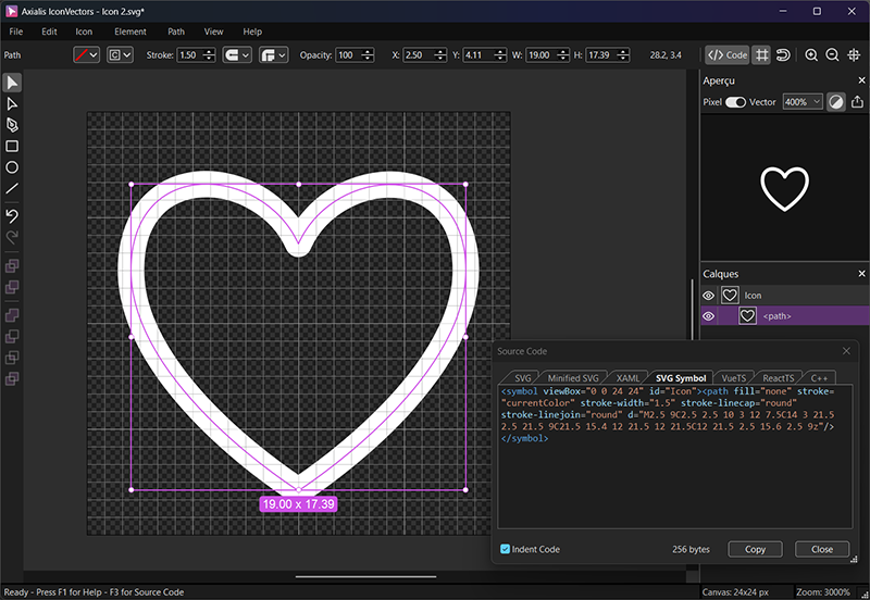
Export a clean SVG from IconVectors
- Design on a consistent grid (e.g., 24×24). Align strokes to whole pixels where possible to avoid blur.
- Set theming strategy:
for single‑color icons, use
currentColoronfillorstrokeso CSS can control color; keep other layers fixed as needed. See the theming tutorial for details. Make icons themeable with CSS. - Check the code viewer (F3): ensure the root has a
viewBox="0 0 24 24", and paths don’t rely on filters that don’t minify well. - Click Copy Button. Use Minified SVG when byte size is critical—see tips below.
Inline usage (HTML)
Embed the SVG right in your markup. This enables CSS control and ARIA labeling.
<!-- Inline SVG (theming via currentColor) -->
<div class="icon text-slate-800 dark:text-slate-200" role="img" aria-label="Heart">
  <svg xmlns="http://www.w3.org/2000/svg" viewBox="0 0 24 24">
    <path fill="none" stroke="currentColor" stroke-width="1" stroke-linecap="round" stroke-linejoin="round"
          d="M2.5,9C2.5,2.45,9.99,3.03,12,7.5C14,3,21.5,2.55,21.5,9C21.5,15.45,12,21.5,12,21.5C12,21.5,2.5,15.55,2.5,9z"/>
  </svg>
</div>
Sprite usage (one definition, many instances)
Define symbols once and reference with <use>. This is great for large icon sets and caching.
<!-- Definition (usually placed near the end of <body> or in a dedicated partial) -->
<svg style="display:none">
  <symbol id="icon-heart-24" viewBox="0 0 24 24">
    <path fill="none" stroke="currentColor" stroke-width="1" stroke-linecap="round" stroke-linejoin="round"
          d="M2.5,9C2.5,2.45,9.99,3.03,12,7.5C14,3,21.5,2.55,21.5,9C21.5,15.45,12,21.5,12,21.5C12,21.5,2.5,15.55,2.5,9z"/>
  </symbol>
</svg>

<!-- Instances (inherit color via CSS) -->
<svg class="text-rose-600" width="24" height="24" role="img" aria-label="Favorite">
  <use href="#icon-heart-24" fill="currentColor"/>
</svg>
<svg class="text-slate-500" width="24" height="24" aria-hidden="true">
  <use href="#icon-heart-24" fill="currentColor"/>
</svg>
Accessibility basics
- Decorative icons: add
aria-hidden="true"on the<svg>to keep screen readers quiet. - Informative icons: add
role="img"and anaria-labelor a visible label nearby. - Prefer inline or sprite SVG over
<img src>when you need ARIA and CSS control.
Theming with currentColor
Using currentColor lets SVG paths inherit the text color from CSS, so you can restyle icons without editing the file.
If your icon is single‑color, set fill="currentColor" or stroke="currentColor". For mixed icons, keep accents hard‑coded and use currentColor for the main layer.
For a detailed walkthrough using IconVectors’ color menus, see the theming tutorial.
.btn-icon { color: #2563eb; }     /* theme via CSS or variables */
[data-theme="dark"] .btn-icon { color: #93c5fd; }
<button class="btn-icon">
<svg viewBox="0 0 24 24" width="20" height="20">
<path d="…" fill="currentColor"/>
</svg> Save
</button>Native vs Minified
- Native SVG keeps readable formatting (helpful during development and code reviews).
- Minified SVG removes whitespace and shortens values for smaller files. Use it when every byte matters (your landing page also links to a dedicated Minified SVG guide).
Reference example (Native SVG)
Here’s the exact sample used on your landing page’s Native SVG tab:
<?xml version="1.0" encoding="utf-8"?>
<svg xmlns="http://www.w3.org/2000/svg" version="1.1" xmlns:xlink="http://www.w3.org/1999/xlink" id="Icon" viewBox="0 0 24 24">
  <path fill="none" stroke="currentColor" stroke-width="1" stroke-linecap="round" stroke-linejoin="round"
        d="M2.5,9C2.5,2.45,9.99,3.03,12,7.5C14,3,21.5,2.55,21.5,9C21.5,15.45,12,21.5,12,21.5C12,21.5,2.5,15.55,2.5,9z"/>
</svg>
Performance tips
- Keep a consistent viewBox (e.g.,
0 0 24 24) across your set to simplify sizing. - Avoid heavy filters; they bloat files and may render inconsistently.
- For stroke icons that scale up, consider
vector-effect="non-scaling-stroke". - Use sprites for repeated icons across a large app to reduce duplication and enable caching.
Naming & folders
/icons/
  /24/
    heart.svg
    check.svg
  /16/
    heart.svg
    check.svg
Troubleshooting
- Color won’t change: a path still has a hard‑coded
fill="#…"orstroke="#…". UsecurrentColorfor the themable layer. - Looks blurry at 1×: align strokes to whole pixels; prefer 24×24 or 20×20 grids.
- ARIA not applied: ensure you’re using inline or sprite SVG, not an
<img>tag.