Bitmap icons go blurry on high-DPI displays and break when a WPF or WinUI app switches between light and dark themes. The fix is to ship icons as
XAML Path geometry: vector data that stays crisp at any DPI and recolors itself when the theme changes. This guide exports that
geometry from IconVectors and wires it into your app — binding Fill and Foreground to brushes, labelling icons with
AutomationProperties.Name, and packaging the paths as a reusable ResourceDictionary.
When to choose XAML code
- You're building desktop apps with WPF or WinUI and need icons that stay crisp at 125%, 150%, and 200% DPI scaling.
- You want icons that inherit theme colors through brushes or a
Foregroundbinding, so light/dark switching needs no extra assets. - You prefer XAML resources you can reuse across styles, control templates, and data templates instead of importing image files.
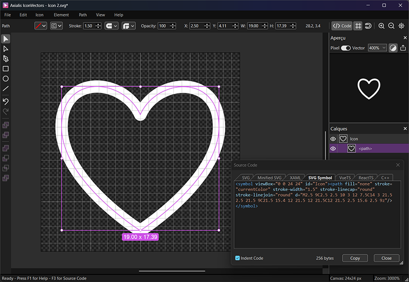
Draw, Import or Trace your icon
- Start by drawing directly in IconVectors. Use the shape, pen, and path tools to build icons on a pixel-perfect grid (16/20/24/32 px). Align strokes to whole pixels for maximum sharpness at small sizes.
- File → Place lets you import an existing SVG file into your current document — useful for reusing symbols or assets from Figma, Illustrator, or Inkscape.
- File → Place and Trace Bitmap inserts a bitmap image (PNG, JPG, BMP, etc.) and converts it to vector paths. The tracing is optimized for monochrome bitmaps like glyphs or scanned sketches; refine the paths after tracing.
- You can also Copy/Paste vector content from external tools. IconVectors interprets SVG data in the clipboard and adds it to the canvas.
- Or draw from scratch using rectangles, ellipses, lines, freeform pen, path editing, and boolean operations for full control.
Export XAML from IconVectors
- Design on a consistent grid (e.g. 24×24). Keep strokes aligned to whole pixels so the geometry snaps cleanly at 100% scale.
- Decide your theming strategy. For single-color icons, bind
FillorStroketo a brush rather than baking in a hex value — that is what lets the icon follow the theme (see below). - Open the Live Code Viewer (F3) and switch to the XAML tab to see the generated
Pathmarkup. - Copy the geometry string or the full
Pathand paste it into your app as shown next.
WPF: simple Path bound to Foreground
<Grid>
  <Grid.Resources>
    <Style x:Key="IconPathStyle" TargetType="Path">
      <Setter Property="Stretch" Value="Uniform"/>
      <Setter Property="Fill" Value="{Binding Foreground, RelativeSource={RelativeSource AncestorType=Control}}"/>
      <Setter Property="SnapsToDevicePixels" Value="True"/>
    </Style>
  </Grid.Resources>

  <Button Padding="8">
    <Path Style="{StaticResource IconPathStyle}"
          Width="24" Height="24"
          Data="M2.5 9C2.5 2.5 10 3 12 7.5C14 3 21.5 2.5 21.5 9C21.5 15.4 12 21.5 12 21.5C12 21.5 2.5 15.6 2.5 9z"
          AutomationProperties.Name="Favorite"/>
    <Button.Content>Favorite</Button.Content>
  </Button>
</Grid>
WPF: package as a reusable resource (Geometry)
<ResourceDictionary xmlns="http://schemas.microsoft.com/winfx/2006/xaml/presentation"
                    xmlns:x="http://schemas.microsoft.com/winfx/2006/xaml">
  <SolidColorBrush x:Key="IconBrush" Color="#2563EB"/>
  <Geometry x:Key="Heart24Geometry">M2.5 9C2.5 2.5 10 3 12 7.5C14 3 21.5 2.5 21.5 9C21.5 15.4 12 21.5 12 21.5C12 21.5 2.5 15.6 2.5 9z</Geometry>
</ResourceDictionary>
<Path Data="{StaticResource Heart24Geometry}"
Width="24" Height="24"
Stretch="Uniform"
Fill="{DynamicResource IconBrush}"
AutomationProperties.Name="Favorite"/>WinUI: PathIcon with themeable brush
<Page.Resources>
  <SolidColorBrush x:Key="IconBrush" Color="{ThemeResource SystemAccentColor}" />
</Page.Resources>

<StackPanel Orientation="Horizontal" Spacing="8">
  <PathIcon Data="M2.5 9C2.5 2.5 10 3 12 7.5C14 3 21.5 2.5 21.5 9C21.5 15.4 12 21.5 12 21.5C12 21.5 2.5 15.6 2.5 9z"
            Foreground="{StaticResource IconBrush}"
            Width="24" Height="24"
            AutomationProperties.Name="Favorite"/>
  <TextBlock Text="Favorite"/>
</StackPanel>
Accessibility checklist
- Set
AutomationProperties.Nameon informative icons so Narrator announces them; omit it on purely decorative icons to avoid noise. - Pick brushes that keep contrast above WCAG 1.4.3 (4.5:1 for small icons that carry meaning) in both light and dark themes.
- Inside a control template, use a
TemplateBindingto the control'sForegroundso the icon stays in sync with hover, pressed, and disabled states.
Theming options (brushes & bindings)
- Bind to
Foregroundso the icon color follows whatever host control hosts it — the simplest option for single-color glyphs. - Use a
DynamicResourcebrush (WPF) orThemeResource(WinUI) so colors swap automatically when the app theme changes. - For two-tone icons, hard-code the accent as a fixed brush and bind only the main shape to the theme brush.
Performance & packaging tips
- Reuse Geometry or PathIcon definitions from a ResourceDictionary to avoid duplication.
- Enable UseLayoutRounding on your window/page for crisper rendering at odd DPI scales.
- Set Stretch="Uniform" and explicit Width/Height for predictable sizing.
- If animating transforms, consider CacheMode="BitmapCache" on the Path to reduce redraw cost.
Reference example (XAML Path)
<Path Width="24" Height="24" Stretch="Uniform"
      StrokeThickness="1" StrokeLineJoin="Round" StrokeStartLineCap="Round" StrokeEndLineCap="Round"
      Data="M2.5 9C2.5 2.5 10 3 12 7.5C14 3 21.5 2.5 21.5 9C21.5 15.4 12 21.5 12 21.5C12 21.5 2.5 15.6 2.5 9z"
      Fill="{DynamicResource IconBrush}"
      AutomationProperties.Name="Favorite"/>
Next steps:
React TS Components,
Vue TS Components,
Native SVG,
Minified SVG,
developer export reference.