Importing raw SVG files into a Vue app leaves you wiring up vite-svg-loader, build config, and ARIA by hand for every icon.
Export each icon from IconVectors as a typed Vue 3 single-file component instead, and you get a <script setup lang="ts"> SFC
with a size prop, attribute fallthrough, accessible labels, and currentColor theming — ready to import and ship.
When to choose a Vue SFC over an SVG file
- You want typed SFCs that forward standard SVG and ARIA attributes (
class,style,width,height,aria-*) throughv-bind="$attrs"withinheritAttrs: false. - You prefer one component per file with a default export, so Vite or Webpack tree-shakes unused icons out of the bundle.
- You want to recolor icons from CSS via
currentColorinstead of editing the file, with a fixedviewBox(e.g.0 0 24 24) so every icon scales the same way. - You would otherwise reach for
vite-svg-loaderor?componentimports, but want the type definitions and ARIA handling generated for you rather than hand-written.
Draw, Import or Trace your icon
- Start by drawing directly in IconVectors. Use the shape, pen, and path tools to build icons on a pixel-perfect grid (16/20/24/32 px). Align strokes to whole pixels for maximum sharpness at small sizes.
- File → Place imports an existing SVG file into your current document — useful for reusing symbols or assets from Figma, Illustrator, or Inkscape.
- File → Place and Trace Bitmap inserts a bitmap image (PNG, JPG, BMP, etc.) and converts it to vector paths. The tracing is optimized for monochrome bitmaps like glyphs or scanned sketches; refine the paths after tracing.
- You can also Copy/Paste vector content from external tools. IconVectors interprets SVG data in the clipboard and adds it to the canvas.
- Or draw from scratch using rectangles, ellipses, lines, freeform pen, path editing, and boolean operations for full control.
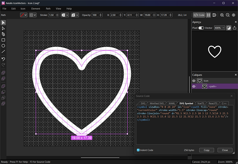
Export a Vue SFC from IconVectors
- Design on a consistent grid (e.g. 24x24). Keep strokes aligned to whole pixels so the icon stays crisp at 1x.
- Set your theming strategy: for single-color icons, set
currentColoronfillorstrokeso CSS controls the color; leave fixed accent colors hard-coded. - Open the Source Code panel (F3) and select the VueTS tab.
- Copy the generated component and save it to your project, e.g.
icons/HeartIcon.vue.
Component template (typed + attribute fallthrough)
<template>
  <svg
    :width="size"
    :height="size"
    viewBox="0 0 24 24"
    v-bind="aria"
    v-bind="$attrs">
    <path
      fill="none"
      stroke="currentColor"
      stroke-width="1"
      stroke-linecap="round"
      stroke-linejoin="round"
      d="M2.5 9C2.5 2.5 10 3 12 7.5C14 3 21.5 2.5 21.5 9C21.5 15.4 12 21.5 12 21.5C12 21.5 2.5 15.6 2.5 9z"/>
  </svg>
</template>

<script lang="ts" setup>
import { computed } from 'vue';

interface IconProps {
  /** Optional accessible label; if omitted, icon is decorative */
  title?: string;
  /** Optional size in px (applies to width/height) */
  size?: number | string;
}

defineOptions({ inheritAttrs: false });
const props = defineProps<IconProps>();

const aria = computed(() =>
  props.title
    ? { role: 'img', 'aria-label': props.title }
    : { 'aria-hidden': 'true' }
);
const size = computed(() => props.size ?? 24);
</script>
Usage examples
<script setup lang="ts">
import HeartIcon from '@/icons/HeartIcon.vue';
</script>

<!-- 1) Decorative icon (screen readers ignore) -->
<HeartIcon class="h-5 w-5 text-rose-600" aria-hidden="true" />

<!-- 2) Informative icon with label -->
<HeartIcon class="h-5 w-5" title="Favorite" />

<!-- 3) Set size via prop or CSS -->
<HeartIcon :size="20" style="color:#16a34a" />
Using an SVG sprite in Vue (alternative)
If you maintain a global sprite, reference symbols with <use href="…"/>:
<!-- In index.html or App.vue once -->
<svg style="display:none">
  <symbol id="icon-heart-24" viewBox="0 0 24 24">
    <path fill="none" stroke="currentColor" stroke-width="1" stroke-linecap="round" stroke-linejoin="round"
          d="M2.5 9C2.5 2.5 10 3 12 7.5C14 3 21.5 2.5 21.5 9C21.5 15.4 12 21.5 12 21.5C12 21.5 2.5 15.6 2.5 9z"/>
  </symbol>
</svg>

<!-- Anywhere in your app -->
<svg width="24" height="24" aria-hidden="true" class="text-rose-600">
  <use href="#icon-heart-24" fill="currentColor" />
</svg>
Accessibility checklist
- Decorative: add
aria-hidden="true"(or omittitlein the template above). - Informative: provide a
title(addsrole="img"+aria-labelviaariabinding). - Prefer inline components or sprites over
<img src="icon.svg">when you need ARIA and CSS control.
Theming with currentColor
Set the main shape's fill or stroke to currentColor so the icon inherits text color from CSS — utility classes, variables, or a parent's color. For fixed accents, keep hard-coded colors on the secondary paths.
.btn-icon { color: #2563eb; }
[data-theme="dark"] .btn-icon { color: #93c5fd; }
<button class="btn-icon inline-flex items-center gap-2">
<HeartIcon :size="20" aria-hidden="true" /> Save
</button>Performance and packaging tips
- One icon per file with a default export keeps imports explicit and lets the bundler tree-shake unused icons.
- Consistent
viewBox(e.g.0 0 24 24) keeps sizing predictable across the whole set. - Minify when shipping: your SFC is minified by Vite or Webpack at build time; if you also need raw SVG files, use IconVectors' Minified SVG export.