


An SVG can use one CSS class to paint several shapes, which makes a shared color easy to change. This guide shows how to edit those definitions in IconVectors, keep individual edits local to the intended artwork, and save the stylesheet inside the SVG.
Use IconVectors 2.20 for Windows. To follow along, download the shared-style dashboard SVG and the gradient shield SVG. Work on copies so you can compare the saved results with their starting code.


Libraries and This Icon have different jobs
Open View > Colors and choose STYLES. Libraries holds reusable .axstyle presets. Applying one copies its appearance into your artwork; editing that library later doesn't change icons that already used it.
This Icon holds definitions in the current SVG's <style> element. Objects assigned to a definition remain linked to it. Editing that definition can update several objects in this document, without changing another icon or a saved library.
The Libraries / This Icon toggle appears when the document has embedded styles. If the SVG has none, the panel shows only Libraries until you embed them.
Open the sample and find a shared definition
- Open the dashboard sample with File > Open... (Ctrl+O). The opening information message explains that its embedded styles are available in the panel; its optional checkbox controls future information messages.
- Choose This Icon. Select a blue corner tile on the canvas. The list highlights its assigned Accent style.
- Select Accent in the list and use Select Users to select both objects directly assigned to that class. Button tooltips identify the toolbar commands.
In View > Source Code (F3), the relationship is visible in the sample:
<style type="text/css">
  .Accent { fill: #2563eb; }
</style>
<rect id="primary-tile" class="Accent" x="2" y="2" width="9" height="9" rx="2"/>
<rect id="status-tile" class="Accent" x="13" y="13" width="9" height="9" rx="2"/>
These are excerpts from the sample, not its complete SVG. Its separate Ink class starts with the same blue, but has a different role. Opening the icon or moving its geometry preserves that distinction.
Change every user through Edit Icon Style
Double-click Accent, or choose Edit Icon Style... for that row. Change its defined fill to another color, inspect the preview and affected-object count, then choose Update Style. Both corner tiles change together. The Ink shapes remain independent.
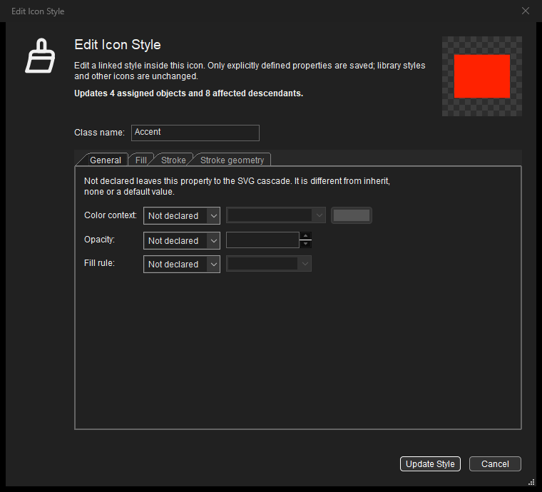
The General, Fill, Stroke and Stroke geometry tabs distinguish Not declared from Defined. A class that only declares a fill shouldn't acquire a stroke because you opened its editor. Leave other properties Not declared to keep inheritance and SVG defaults. The update is one Undo step; Cancel leaves the draft unapplied.
Change just one object through the normal controls
Undo the shared change, select only one Accent tile and change its fill with a palette, the COLORS picker or the Control Bar. IconVectors updates that object and its embedded assignment together. It reuses a matching definition or creates a separate one, so the other tile keeps its blue appearance.
This is automatic: there is no override mode to manage. Matching appearances can share a style; obsolete generated definitions are removed as editing makes them unnecessary. Deliberately unused New or Duplicate definitions stay available for assignment.
To assign an existing definition deliberately, select the artwork, select the desired row in This Icon, and choose Assign Style to Selection. Clicking a row alone only inspects it. Selecting objects with different assigned styles clears the common style highlight. Ctrl+Z restores an artwork edit and its automatic style changes together.
Create embedded styles from ordinary artwork
For an SVG that uses individual fill and stroke attributes, choose Icon > Styles > Embed Styles in Icon.... The command scans the whole document, including unsaved edits. Your current selection doesn't limit it.
- Review each proposed appearance, its automatic class name and its number of users.
- Rename classes in the list or Style name field if meaningful roles would help. Enter valid, unique class names without a leading dot.
- Choose Embed Styles. Matching supported appearances become shared definitions, and corresponding appearance attributes move from the objects into those classes.
Geometry, local gradient resources and the context of inherited currentColor or group opacity are preserved. This Icon opens automatically, and the document becomes modified. The conversion supports Undo; Cancel changes nothing. For a blank icon, the command enables embedded mode immediately. You can also select Embed Styles in Icon when creating a new icon.
Keep gradients in the same SVG
Open the shield sample. Its Shield class points to a normal local SVG resource:
<style type="text/css">
  .Shield { fill: url(#shield-gradient); }
</style>
The matching <linearGradient id="shield-gradient"> remains in <defs>, with blue and violet stops. The CSS rule references that gradient; it isn't a CSS linear-gradient() function. In Edit Icon Style, a defined paint can refer to an existing local gradient using url(#shield-gradient). That field doesn't create a new resource.
Applying a supported gradient preset from Libraries also updates the managed embedded appearance and brings its required resources into the icon. It creates no link back to the library.
Save shared styles, or remove them deliberately
Save normally with Ctrl+S. The SVG contains its maintained stylesheet and assignments, without separate library files or local appearance overrides. Reopen the saved copy and inspect its classes with F3. If application code depends on particular names, check them after editing: automatic maintenance can split, reuse or remove definitions as the artwork changes.
To return to individual appearance properties, choose Icon > Styles > Remove Embedded Styles... and confirm. IconVectors removes the stylesheet and distributes the appearance to the artwork. Save under a new name if you want both versions. This document conversion is Undoable before closing.
The visual editor supports simple named classes and the documented appearance properties. Complex selectors, external stylesheets, CSS variables or source-dependent rules can require source review or an explicit flattened copy. Follow that diagnostic rather than assuming every browser CSS feature is editable. See the supported embedded-style rules and conversion choices.
Use definition edits when a shared role should change everywhere in this icon. Use normal appearance controls when only selected artwork should change. Both workflows keep the SVG's embedded styles managed as you draw.
Related guides
- Build a consistent icon family with reusable style libraries.
- Edit SVG files and inline SVG from Visual Studio Code.
- Check and export SVG folders from the command line.
- Use currentColor to make SVG icons follow application colors.
Start Making SVG Icons Today with IconVectors
Download the fully-functional 30‑Day Free Trial and unlock your icon design workflow.
Windows 2.20 (November 4, 2026). macOS 2.10 and Linux 2.10 are also available.