Working with Styles
A style describes an element’s appearance: paints, gradients, stroke settings and opacity. The STYLES page provides two separate ways to use styles:
Libraries contains reusable appearance presets in
.axstylefiles. Applying a preset copies its appearance; the icon is not linked to the library.This Icon manages styles embedded in the current SVG. These are shared definitions linked to objects in that icon and saved inside its SVG file.
Open , then choose the third tab, STYLES, after PALETTES and COLORS. When the current icon contains embedded styles, the left-aligned Libraries / This Icon toggle appears at the top to switch between the two views. Without embedded styles, the panel shows Libraries and the entire toggle row is hidden. Use Embed Styles in Icon to build shared styles from that icon’s appearance. You can also enable Embed Styles in Icon in the New Icon dialog. This starts an empty stylesheet and makes This Icon available before you draw. Create shared definitions there and assign them to your artwork, or draw normally and let IconVectors create styles automatically. Embed Styles by Default in Preferences selects this option for future new icons. When the toggle has keyboard focus, Left and Right choose a view; Space or Enter switches between them. In Libraries, the library list chooses which collection to display. Each compact square entry shows a fixed sample shape and a single line with the style’s name, rather than a copy of the source icon. Long names are shortened with an ellipsis; hover for the full name and Click to apply. The gallery has no permanent help footer; save or loading problems are still reported when necessary.
IconVectors includes the Axialis and My Styles starter libraries. On the first launch after installing or updating to 2.20, My Styles is selected; later launches remember the library you choose. This does not apply a style to your artwork or change the selected Colors-panel tab. You can edit or rename these libraries like your own collections. Updates preserve your changes, and a starter library you delete is not automatically restored.
The Libraries toolbar places New Style from Selection, Delete Style and Style Library Menu beside the library list. A separator groups the final Embed Styles in Icon / Remove Embedded Styles button separately. With no document open, that document command is grayed out.
Clicking a style with the mouse returns keyboard focus to the canvas, so you can immediately move the selected artwork with the arrow keys. This also applies to mouse selection and the Assign / Select Users buttons in This Icon. Use Tab to enter a list when you want keyboard navigation; keyboard-driven selection and text editing keep their focus.
Library styles are independent snapshots, not linked CSS classes. Applying a style copies its appearance to selected artwork or, with no selection, to the defaults for new drawing. Editing or deleting that saved style later does not change artwork to which you previously applied it. For an icon with embedded styles, applying a library preset also updates that icon’s embedded definitions automatically; it creates no link to the library.
Create a style from an element
Select exactly one drawable element in the Editor.
Choose a library in STYLES, or use New Library in the library menu.
Choose New Style from Selection and enter a descriptive name.
You can also choose or Styles > New Style from Selection… in the canvas context menu. uses the same command. This opens the Styles page and saves into its currently chosen library. If no library exists, the first capture creates My Styles. These editor commands require one visible, unlocked drawable element; full appearance validation runs when you invoke them.
The accepted style is saved immediately in that library. To replace the appearance of an existing preset, select its entry and choose Update Style from Selection. This updates the saved preset, not other icons that have used it.
This single-style command requires one drawable source. A group or several selected elements does not describe one unambiguous appearance, so capture explains the problem instead of silently using the first element. Select the intended child element and try again.
Captured properties include:
Fill and stroke: no paint, solid colors with transparency, symbolic
currentColor, and supported linear or radial gradients.Stroke width, dash pattern and offset, line cap, line join and miter limit.
Element opacity, fill opacity, stroke opacity and fill rule.
The source’s geometry, coordinates, identifiers, text, transforms and canvas dimensions are not part of the preset. A style is not an icon or an overlay. Unsupported effects are diagnosed rather than silently omitted.
Add All Styles to Library
Choose , Styles > Add All Styles to Library… in the canvas context menu, or Add All Styles to Library… in either Styles panel menu. Unlike single-element capture, this inspects the current icon rather than just the selected artwork.
Choose the destination library, or prepare a new library in the dialog.
Review the distinct appearances, their previews and how many elements use each.
Select the new styles to add and edit their suggested names if needed.
Choose Add Selected to save the reviewed additions.
Repeated appearances produce one candidate, not a separate style for every
element. Comparison uses the supported appearance properties, not names or
SVG identifiers. Equivalent notation such as #FFF and #FFFFFF matches.
If the destination library already contains that appearance, the existing entry
and its name are retained; it is not duplicated or overwritten. Changing the
destination updates these matches. A result containing only existing styles
does not need another library write.
currentColor remains different from a fixed color, even when they currently
look the same. Authored color context, opacity, stroke settings and supported
gradient properties also remain meaningful parts of the comparison. Previews
are visual aids, not the duplicate-detection method.
Hidden, locked or unsupported sources are reported instead of approximated. Review those diagnostics and any warning about ancestor group opacity before saving the supported candidates. If source provenance cannot be mapped safely or a capture limit is reached, the operation reports the problem rather than silently accepting an incomplete set.
The icon, selection and Undo history are unchanged. Cancel writes nothing, including no empty new library. Saving additions is a library file operation, not Editor Undo. If another instance changes the destination during review, the save is rejected and the pending library draft is retained for recovery; see Saving, other instances and recovery.
Apply a style
Select the target artwork, then click a style. A normal click applies its complete appearance. All supported selected elements are processed together; selected groups expand to their drawable descendants without applying twice to children that are also selected individually.
The elements remain selected, so you can immediately move or resize them. Their geometry and placement stay unchanged. Use Ctrl+Z to undo the whole application in one step, and Redo to restore it. Reapplying an identical appearance does not add an unnecessary Undo step.
With no artwork selected, explicitly applying a preset sets the appearance for new drawing instead. It does not recolor existing artwork.
Partial application
Right-click a style to open its context menu:
Apply Complete Appearance uses the complete saved appearance.
Apply Fill Only applies the fill paint, fill opacity and fill rule.
Apply Stroke Only applies the stroke paint, stroke opacity, width, dash pattern and offset, cap, join and miter limit.
Partial modes leave element opacity unchanged. They also use a saved authored
color context when the preset contains one. If changing that shared context
would change the opposite paint’s currentColor appearance, including its
gradient stops, the partial operation is rejected. Use Apply Complete
Appearance if you intend to replace both channels. See
Colors, gradients and opacity.
Right-click does not apply Stroke automatically, unlike the palette swatches and Colors picker. The menu makes the chosen scope explicit. Normal clicking continues to apply the complete style.
IconVectors checks all targets before changing them. If a target or its SVG effects cannot be handled faithfully, the operation reports the reason instead of partially changing the selection.
Keyboard and ordering
Use the arrow keys, Home and End in the gallery to select a preset without applying it. Press Enter to apply the selected style. Press Delete to request removal, then confirm or cancel.
Drag entries within the gallery to reorder them, or choose Sort Styles by Name. Dragging an entry outside the gallery does not silently delete it.
Use a style for new drawing
Clear the artwork selection, then click a library style or press Enter to apply it. Apply Complete Appearance sets the new-drawing appearance; Apply Fill Only or Apply Stroke Only changes just that channel, using the same property scopes described above. Merely highlighting a preset with the arrow keys, switching libraries, refreshing or reordering entries does not apply it.
New shapes and text use the accepted appearance, including supported gradients, transparency, separate opacities, stroke settings, fill rule and authored color context. Existing artwork stays unchanged. The line tool retains its normal no-fill, visible-stroke behavior rather than unexpectedly drawing an invisible line. Later manual default changes take precedence for the properties you edit.
Applying defaults alone does not change the icon’s source, resources, selection, dirty state or Undo history. Drawing an object is still one ordinary Undo action. Its Redo restores the appearance captured when that object was created, even if you have since changed the current defaults.
These rich style defaults last for the running session; they are not a saved startup preset or a link back to the library. Apply the style again in a later session when needed. Ordinary drawing-default persistence outside this style mode is unchanged. This workflow uses Libraries, not This Icon class assignment.
Colors, gradients and opacity
currentColor stays symbolic. A gray preview of symbolic paint is only a
preview fallback; it is not saved as the style’s fixed RGB color. If the source
has an authored SVG color context, that context is captured. Without such
a context, the symbolic paint uses the target’s color context when applied.
No paint is different from transparent paint. A style with fill:none
removes the fill; a transparent solid fill is still a paint with transparency.
Fill opacity, stroke opacity and element opacity are separate properties.
Gradient resources travel with the style. Supported local gradient references are captured into a self-contained appearance. Applying the style creates the necessary target resources with nonconflicting IDs; the original icon does not have to remain open.
Relative gradients follow the target’s bounding box. Absolute gradients retain their SVG user-unit coordinates; they are not automatically fitted to differently sized artwork. Likewise, stroke widths and dash lengths retain their SVG user-unit values instead of scaling to the target’s size.
An ancestor group’s opacity is a compositing effect on the group as a whole. It is not multiplied into every captured child. As a result, a captured child’s preview can differ from its appearance inside that group. Group transforms and compositing are not replaced when styling its children.
Styles deliberately reject unsupported or unsafe input. Depending on the source, this can include patterns, filters, masks, clipping, markers or gradient semantics that cannot be preserved. Keep the original SVG and follow the diagnostic rather than assuming the missing effect was saved.
The initial implementation also checks the imported source’s appearance. After
converting or deleting an unsupported imported element, IconVectors may no longer
be able to map that source information safely to the current artwork. Capture
or application then reports styles.unmapped_source without changing the
document. This restriction can persist for that editing session, even if the
remaining visible artwork looks simple.
Keep your original SVG. Work from a clean, supported source or a separate supported icon and load that document before using Styles. Saving and reopening a converted SVG is not a guarantee that the original unsupported features were preserved; do not use it as a supposedly lossless repair procedure.
Manage style libraries
The library menu provides:
New Library, Rename Library and Delete Library.
New Style from Selection, Update Style from Selection, Edit Style, Duplicate Style, Rename Style and Delete Style.
Add All Styles to Library to collect distinct supported appearances in one review.
Sort Styles by Name, Refresh Libraries and Open Styles Folder.
Import Library and Export Library for sharing
.axstylefiles.
Deleting a style removes that entry, not the whole library. Deleting a library removes the complete collection. Both are separate from deleting or changing artwork in an icon. Read the confirmation before accepting a removal.
Importing copies a library into IconVectors’ user storage; it does not move or
change the file you selected. An import whose stable library identity already
exists is refused, even if you change the file’s name. Display names are not
identities, and different libraries can have the same display name. Exporting
writes a separate library file that you can back up or share with another
IconVectors user. The proposed filename uses the library’s display name followed
by .axstyle; characters that cannot be used in filenames are replaced. You
can edit this filename without renaming the library or changing its identity.
Choose an export destination outside the managed Styles
folder; use library commands to modify the managed copies.
An .axstyle library uses a versioned Axialis XML format with XAML-style brush
notation. It is not an arbitrary WPF or Avalonia XAML file. Loading a style library
does not execute XAML objects, scripts, bindings or external resources. Unsupported
format versions or unsafe XML are rejected with a diagnostic.
Edit a saved style
Select a saved style, then choose Edit Style… in the library menu or right-click that style and choose the same command. You do not need an icon selected or open to edit a preset.
The dialog edits a temporary copy and previews its appearance. Save validates and saves the library immediately; Cancel discards the dialog changes. Editing retains the style’s identity and position in its library. It does not modify any icon that previously used the preset, and is not part of Editor Undo.
Editable appearance includes the name; element, fill and stroke opacities;
fill rule; each paint type (none, solid, currentColor, linear or radial
gradient); stroke width, line cap/join, miter limit, dash pattern and offset;
and the optional authored SVG color context. Color buttons use the
Axialis or standard color picker selected in Preferences. Transparent colors
and symbolic currentColor remain distinct from None.
The color picker changes RGB while preserving existing alpha. Edit the alpha
component directly in the SVG color field when you want to change transparency;
paint and overall opacities remain separate controls.
The bordered tabs group general settings, fill, stroke and stroke geometry. Stroke width uses up/down arrows in 0.25-unit steps and displays two decimal places, like the Control Bar. Opacity controls use percentages with 10-point steps. Line-cap and line-join selectors use the same symbols as the Control Bar. An existing precise value is kept unchanged unless you edit its control; simply opening the dialog or moving between fields does not round your saved style.
Gradients include stops with offset, color and opacity, units, spread method, transform and optional SVG coordinates. Blank optional coordinates retain the SVG default rather than forcing a value into the preset. Coordinates can use percentages; stroke measurements remain in SVG units. Supported gradients use sRGB interpolation and zero focal radius; unsupported semantics are rejected, not silently converted. Untouched precise values are preserved when saving.
If another instance changes the library while this dialog is open, Save reports the revision conflict and retains your pending edit for recovery. See Saving, other instances and recovery before closing with unsaved library changes.
Saving, other instances and recovery
Use Open Styles Folder in the library menu, or
, to find your libraries.
On Windows, the default location
is %APPDATA%\Axialis\IconVectors\Styles. On macOS it is the established
IconVectors user-data folder’s Styles subfolder; on Linux it is the
application’s XDG data folder’s Styles subfolder, not the configuration folder.
The storage directory is created when a library is first saved or imported.
Managed filenames use a stable library ID, not the editable display name.
Accepted library edits are saved immediately, not only when IconVectors closes. Another instance can load them when its library view refreshes. Refresh Libraries reloads the available files explicitly.
If an individual library file is malformed, library discovery skips that file and displays a warning; other valid libraries remain available. The skipped file is not deleted or rewritten. Keep a copy of it and correct the reported problem before refreshing or importing it again. Filesystem access failures are still reported as errors rather than treated as a successful refresh.
If another instance changed the same library, IconVectors does not silently overwrite its changes. A failed save also keeps the last valid disk file intact. Follow the displayed recovery instructions; Retry Save retries a pending change, while Save Pending Changes as New Library preserves it independently. Do not close the application while a pending edit still needs recovery.
Important
Library changes are file operations, not Editor Undo. Keep exported copies of valuable libraries. Recovery backups are bounded and are not a replacement for a versioned backup of your personal presets.
The Styles folder retains two recovery snapshots: .last-saved.axstyle holds
the preceding library contents before the latest accepted library edit, including
a style deletion; .last-deleted.axstyle holds the latest deleted library.
Each is a single shared backup for the folder, not a history for every library.
A later edit or deletion can replace the corresponding snapshot.
To recover a snapshot, first copy it to a safe location outside the Styles folder. If that library no longer exists, use Import Library to import the saved copy. If its identity still exists, first export the current library too. Import never silently overwrites it: replacing the current library with the recovery copy requires explicitly deleting the current library after preserving both copies, then importing the recovery copy. Merely renaming a file does not change its stored library identity.
Applying a style to an icon never modifies the saved library. You still save the edited SVG normally, just as after any other Editor operation.
Applying styles to several saved icons
In Explorer, select the SVG files and choose . Choose a saved library and preset, Complete, Fill only or Stroke only, and either all artwork or exact SVG IDs. The batch can modify originals or create copies with reviewed destinations. It uses the same appearance semantics as the panel, but disk changes are not part of Editor Undo.
The preview captures the library contents. Editing or replacing that library invalidates the plan instead of changing the meaning of an already reviewed operation. Use Back to choose the updated style and preview again. See Batch Apply Style for targeting, options and safety rules.
Manage styles embedded in this icon
For an icon that contains embedded styles, choose This Icon in the STYLES
page to work with shared style definitions
inside the open SVG. Unlike an .axstyle preset, an embedded style remains
linked to the objects assigned to it. Editing that definition can update several
objects at once, without changing other icons or your saved libraries.
For example, this SVG defines a shared fill called Green and assigns it to
a path:
<style>.Green { fill: #039C23; }</style>
<path class="Green" d="M4 4H20V20H4Z"/>
In this mode, each drawable element uses one embedded style. Elements with matching property sets can share a definition. Normal artwork edits maintain these definitions automatically, without local appearance overrides; see Automatic styles while editing. This is different from Add All Styles to Library, which saves independent appearance snapshots in a reusable library.
Embed Styles in Icon
For an icon without embedded styles, choose , or Styles > Embed Styles in Icon… in the canvas context menu. You can also use the stylesheet button in the Styles toolbar, or the same command in the Styles panel’s dropdown and right-click menus. In the Icon menu, Styles is directly below Recolor with Palette. Its first command embeds styles inside the SVG, or becomes Remove Embedded Styles when shared styles exist. Below the separator, the two capture commands save independent presets in a library.
For a blank icon with no elements, Embed Styles in Icon switches directly to an empty embedded stylesheet and opens This Icon. No review dialog is needed. Remove Embedded Styles switches the blank icon back just as directly. Both changes support Undo and leave Preferences defaults unchanged. For an icon containing artwork, the review and confirmation described below still apply.
IconVectors scans the whole current icon, including unsaved changes. Matching supported appearance declarations are collected into shared CSS classes; the artwork selection does not limit the scan. Colors, stroke settings, gradients and opacity retain their meaning and appearance.
The review lists a preview, an automatic class name such as Style1, and
the number of elements using each style. Rename a class directly in the list
or use the selected row’s Style name field. Enter names without a leading
dot; names must be valid, unique CSS class names. All listed styles are included.
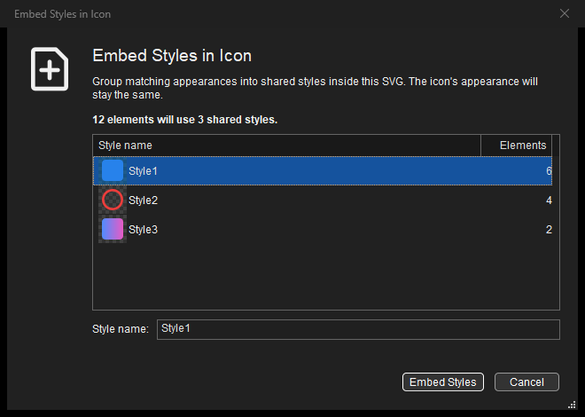
Review the automatically generated styles before changing the icon.
Choose Embed Styles to create the embedded stylesheet and assign its
classes. Appearance declarations moved into a class are removed from the
corresponding elements’ SVG attributes or inline styles. Existing gradient
resources, geometry and unrelated classes remain. Inherited currentColor
and group opacity keep their original context instead of being flattened into
child elements. Locked or unsafe conversions are reported before changes are made.
After creation, the Libraries / This Icon toggle appears and This Icon
opens automatically. The icon is marked modified; save it when ready. The
conversion is one Ctrl+Z step, and Cancel leaves the icon unchanged.
Saved .axstyle libraries are unaffected.
The command is intended for icons without an existing embedded stylesheet. Manage an already styled icon with the commands below, or explicitly remove its shared styles as described next. While embedded mode is enabled, IconVectors maintains the style assignments as you continue editing.
Remove Embedded Styles
When the icon contains an embedded stylesheet, including an empty one, the first command becomes . The same action is available in the canvas context menu and the Styles panel’s toolbar and menus. The rightmost Styles toolbar button shows a document with a plus sign for embedding, or a document with a minus sign for removal.
For an icon with elements, choose Remove Styles in the confirmation to replace shared class styling
with local element properties. The shared <style> element and its class
links are removed. Local declarations may use style="..." attributes;
these apply to individual elements rather than defining shared classes.
Unrelated class names, gradients and inherited color context are retained.
If a conversion cannot safely preserve the appearance, or would change locked
elements, IconVectors reports the problem and leaves the icon unchanged.
After removal, the panel shows Libraries and hides the Libraries / This Icon row. The updated code is visible in F3, and the icon is marked modified so you can save it when ready. The entire conversion is one Ctrl+Z step: Undo restores the shared definitions and makes This Icon available again. Cancel leaves the icon unchanged. Saved style libraries are unaffected.
Opening an icon with embedded styles
After a supported styled SVG opens in the Editor, an information message explains where its styles are available. Choose Show Styles to display This Icon, or OK to continue without changing the visible panel. The styles remain in the SVG; they are not automatically copied into an AppData library. Supported appearances are organized into one embedded style per drawable element, ready for automatic maintenance as you edit.
Use Don’t show this message again to save your preference immediately. To restore the message, enable Show information when an icon contains embedded styles in . See Information about embedded styles. Suppressing this information never suppresses an error or permission to convert unsupported source.
Find a style and its users
The list shows each class with its exact name, direct-use count and status. Unused means that no object is directly assigned to that class. Intentionally unused definitions, such as a style you have just created, remain available for assignment. Obsolete generated definitions are removed automatically. A style assigned to a group can also affect its descendants through inheritance. Hover over the list for additional details about the selection, assigned objects and affected descendants. There is no permanent information line below the list. Hover over a toolbar icon for a short explanation of its command.
Selecting artwork highlights its assigned embedded style when every selected object uses the same definition. A selection with different styles clears the style highlight. You can select another row without changing the artwork selection, then use Assign Style to Selection to apply it.
Click a row to inspect it without changing the artwork selection. Use Select Users when you want to select the objects directly assigned to that class. Double-click a style, or press Enter, to edit an editable rule. Source-managed rules remain visible but require source review rather than the property editor.
This Icon toolbar
The icon buttons sit directly below Libraries / This Icon, above the style list. From left to right:
Command |
Use |
|---|---|
New Style (square with plus) |
Create a shared definition in this icon, ready to assign to artwork. |
Assign Style to Selection |
Link the selected artwork to the style selected in the list. |
Select Users |
Select the objects directly assigned to the listed style. |
Edit, Duplicate, Delete |
Manage the selected definition. Deleting a used style asks before keeping its users’ appearance through another embedded definition. |
Remove Embedded Styles (document with minus) |
Remove the whole stylesheet, keeping the appearance as local properties. A blank icon switches directly; icons with elements require confirmation. |
Icon Styles Menu (three vertical dots) |
Open the style-management commands, including Rename and Show Source Code. |
Separators group the editing commands. The overflow arrow appears only when tools do not fit and provides those available commands. It disappears when the panel is wide enough to show every tool. The menu button keeps all commands visible, with unavailable ones grayed out. Right-click the list for the same style actions. Tools are disabled when their document, rule or artwork selection is unavailable; source-managed definitions keep their editing restrictions. New Style, Remove Embedded Styles and Icon Styles Menu do not require a selected style. Assign needs editable selected artwork; Select Users needs a style with assigned objects.
The toolbar follows artwork and style-list selections immediately. Its menu buttons use the same three-dot icon in Libraries and This Icon.
The Layers panel shows directly assigned class names in the object’s tooltip. Right-click an object and choose Edit Icon Styles… to open This Icon without changing a saved library.
Edit a shared icon style
Choose Edit Icon Style… for the selected rule. The decorated dialog uses the familiar General, Fill, Stroke and Stroke geometry tabs, with a preview of the actual icon and a count of affected objects.
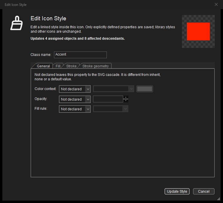
Only explicitly defined properties belong to the shared class. The other properties remain available through inheritance or the SVG defaults.
Each property has two states:
Not declared leaves that property out of this rule. It can then come from an ancestor or the SVG default.
Defined saves the value you specify. Values such as
inherit,noneand transparent paint are explicit declarations, not an absent property.
For example, editing the fill of .Green { fill: #039C23; } must not add a
stroke or opacity declaration. Leave those properties Not declared unless
you want the class to control them too.
Supported controls cover authored color context, element/fill/stroke
opacity, fill rule, fill and stroke paints, width, cap, join, miter limit, dash
array and dash offset. Paints can refer to an existing local gradient using
url(#gradient1); this does not copy a gradient from a library or create a
new gradient automatically. Color buttons follow the Axialis/system picker
preference.
Use Update Style to commit the validated draft as one Undoable document change. All applicable users of that rule can change, not only the selected artwork. Cancel discards the draft. Locked or unsupported affected objects block the operation before a partial edit is made. The SVG file on disk is not changed until you save it.
New Icon Style… creates a new, initially unused definition; assign it explicitly to artwork afterward. Duplicate Icon Style… starts a separate definition from an editable rule. Class names are case-sensitive and entered without the leading dot shown in the list. Rename Icon Style… updates the class and its assignments, after confirming that a host application’s theme may depend on its original name.
Automatic styles while editing
Use Libraries, a color palette, the COLORS picker or the control toolbar as usual. Changes to fill, stroke, opacity, width, caps, joins and other supported appearance properties update the selected artwork and its embedded style together. New shapes also receive a style automatically.
If only one user of a shared style changes, IconVectors gives that element a matching existing style or creates a separate definition. Other users keep their appearance.
Matching property sets reuse a definition. Existing names are retained where possible, and new definitions receive automatic names such as
Style1. Already linked named styles keep their separate identities when you open an icon or edit its geometry, even if they currently look alike. Their names can represent different theme roles in the application using the SVG.Generated or previously used definitions are removed when they become obsolete. A deliberately unused New or Duplicate definition remains available until you assign or delete it.
For example, two green shapes can share Green. Changing one shape to blue
creates or reuses a blue style while the other shape stays green. Changing it
back lets both use the matching green definition again. Style assignments stay
consistent automatically.
To apply a particular definition, select artwork in the Editor, select its row in This Icon, then choose Assign Style to Selection or Assign to Selection. This replaces the previous influencing style, so the chosen definition takes effect. Properties it does not declare can still inherit from the element’s group or use SVG defaults.
Editing a definition with Edit Icon Style… is different: it deliberately updates all of that style’s users and retains its named role. Delete Icon Style… asks before deleting a used definition and keeps the artwork’s appearance through another embedded style. To leave embedded mode entirely, use Remove Embedded Styles.
The artwork edit and automatic style changes form one Ctrl+Z step.
Undo and Redo restore both together. Group opacity, inherited colors, symbolic
currentColor and gradient resources retain their context. These edits do
not modify your saved .axstyle libraries.
Save the SVG with its styles
Normal Save stores the maintained embedded definitions and one-style assignments inside the SVG, without local appearance overrides. The Source Code viewer, minified SVG output and document recovery use the same authored-style model. You do not need to export a separate library or keep a sidecar file with the icon. Formatting can change; preserving style meaning is not a promise of byte-for-byte identical SVG source.
You can give classes meaningful names for use in your application, but automatic maintenance can split, reuse or remove definitions as artwork changes. Check class names used by external theme code after editing. IconVectors does not simulate every framework’s theme; test the saved icon in the application that will use it.
Supported styles and conversion choices
The visual workflow supports simple named class selectors such as .Green
and the appearance properties described above. It is not a complete browser CSS
editor. Complex selectors, CSS variables, external stylesheets, animation and
some source-dependent conversions are outside this version’s editable range.
CSS declarations that control geometry, such as width, x or r, also
require source review or an explicit flattened copy; ordinary SVG geometry
attributes remain editable.
Repeated class rules, important declarations or other preserved properties
can make a rule Source-managed rather than directly editable.
When preservation cannot be proved safe, IconVectors explains the reason instead of silently claiming that the original styles were retained. The open message offers:
Review SVG Source… to inspect the original source and, where appropriate, correct it using the SVG source repair dialog.
Open Flattened Copy to open a separate editable version without shared style/theme links. Review the rendered result, particularly if the original contains unsupported SVG/CSS. The original is not automatically overwritten.
Cancel to leave the current document unchanged.
Transforms, automatic downsizing, unsupported resource bindings or clipboard operations can require this safe-conversion route. During editing, an operation that would lose a preserved binding is rejected before changing the document. Follow its diagnostic: review the source or work on an explicit flattened copy. Do not assume that an operation is lossless merely because the current preview looks similar.
When inserting or pasting styled artwork into another icon, explicitly choosing Insert Flattened Artwork removes its source class links. This prevents an unrelated same-named class in the destination from restyling the inserted shapes. Cancelling leaves that insertion unapplied.
Disabling strict checking or the opening information message does not bypass these mandatory preservation and resource-safety checks.