


Bitmap icons can blur when scaled and may need alternate colors for light and dark themes. For WPF and WinUI, an alternative is to ship icons as
XAML Path geometry: scalable vector data whose colors can follow your app's brushes and theme resources. This guide exports that
geometry from IconVectors and wires it into your app — binding Fill and Foreground to brushes, naming actionable controls with
AutomationProperties.Name, and packaging the paths as a reusable ResourceDictionary.
When to choose XAML code
- You're building desktop apps with WPF or WinUI and need icons that stay crisp at 125%, 150%, and 200% DPI scaling.
- You want icons that inherit theme colors through brushes or a
Foregroundbinding, so light/dark switching needs no extra assets. - You prefer XAML resources you can reuse across styles, control templates, and data templates instead of importing image files.
Draw, Import or Trace your icon
- Start by drawing directly in IconVectors. Use the shape, pen, and path tools to build icons on a pixel-perfect grid (16/20/24/32 px). Align strokes to whole pixels for maximum sharpness at small sizes.
- File → Place Files lets you import an existing SVG file into your current document — useful for reusing symbols or assets from Figma, Illustrator, or Inkscape.
- File → Place & Trace Bitmap inserts a bitmap image (PNG, JPG, BMP, etc.) and converts it to vector paths. The tracing is optimized for monochrome bitmaps like glyphs or scanned sketches; refine the paths after tracing.
- You can also Copy/Paste vector content from external tools. IconVectors interprets SVG data in the clipboard and adds it to the canvas.
- Or draw from scratch using rectangles, ellipses, lines, freeform pen, path editing, and boolean operations for full control.
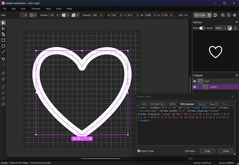
Export XAML from IconVectors
- Design on a consistent grid (e.g. 24×24). Keep strokes aligned to whole pixels so the geometry snaps cleanly at 100% scale.
- Decide your theming strategy. For single-color icons, bind
FillorStroketo a brush rather than baking in a hex value — that is what lets the icon follow the theme (see below). - Open View → Source Code (F3) and switch to the XAML tab to see the generated
Pathmarkup. - Copy the geometry string or the full
Pathand paste it into your app as shown next.
WPF: simple Path bound to Foreground
This WPF example gives the button one content container, holding both the icon and its visible label. The decorative path has no separate accessible name. Use it within a WPF window or page with the standard presentation and x: namespaces.
<Grid>
  <Grid.Resources>
    <Style x:Key="IconPathStyle" TargetType="Path">
      <Setter Property="Stretch" Value="Uniform"/>
      <Setter Property="Fill" Value="{Binding Foreground, RelativeSource={RelativeSource AncestorType={x:Type Button}}}"/>
      <Setter Property="SnapsToDevicePixels" Value="True"/>
    </Style>
  </Grid.Resources>

  <Button Padding="8" AutomationProperties.Name="Favorite">
    <StackPanel Orientation="Horizontal">
      <Path Style="{StaticResource IconPathStyle}"
            Width="24" Height="24" Focusable="False"
            Data="M2.5 9C2.5 2.5 10 3 12 7.5C14 3 21.5 2.5 21.5 9C21.5 15.4 12 21.5 12 21.5C12 21.5 2.5 15.6 2.5 9z"/>
      <TextBlock Text="Favorite" Margin="8,0,0,0"
                 VerticalAlignment="Center"/>
    </StackPanel>
  </Button>
</Grid>
RelativeSource finds the containing Button and tracks its Foreground. This is WPF syntax. It does not automatically track brushes applied only inside a control template; test hover, pressed, focused, and disabled states with your actual style.
WPF: package as a reusable resource (Geometry)
Place these entries in your WPF window or application resources, or merge this dictionary into them, before using the path below. Share the Geometry, and create a separate Path for each use.
<ResourceDictionary xmlns="http://schemas.microsoft.com/winfx/2006/xaml/presentation"
                    xmlns:x="http://schemas.microsoft.com/winfx/2006/xaml">
  <SolidColorBrush x:Key="IconBrush" Color="#2563EB"/>
  <Geometry x:Key="Heart24Geometry">M2.5 9C2.5 2.5 10 3 12 7.5C14 3 21.5 2.5 21.5 9C21.5 15.4 12 21.5 12 21.5C12 21.5 2.5 15.6 2.5 9z</Geometry>
</ResourceDictionary>
<Path Data="{StaticResource Heart24Geometry}"
Width="24" Height="24"
Stretch="Uniform"
Fill="{DynamicResource IconBrush}"
Focusable="False"/>IconBrush is an illustrative fixed color, not an automatically changing theme palette. WPF DynamicResource reevaluates the reference when the resource changes; your app must provide the appropriate brush for each theme and background. This path is decorative; expose any required meaning through its containing control or an accessible text equivalent.
WinUI 3: PathIcon with a theme brush
In a WinUI 3 page, use Microsoft.UI.Xaml controls and ThemeResource, not WPF DynamicResource or FindAncestor bindings. This command button exposes one accessible name; its icon is decorative.
<AppBarButton Label="Favorite"
              AutomationProperties.Name="Favorite"
              Foreground="{ThemeResource TextFillColorPrimaryBrush}">
  <AppBarButton.Icon>
    <PathIcon Data="M2.5 9C2.5 2.5 10 3 12 7.5C14 3 21.5 2.5 21.5 9C21.5 15.4 12 21.5 12 21.5C12 21.5 2.5 15.6 2.5 9z"
              AutomationProperties.AccessibilityView="Raw"/>
  </AppBarButton.Icon>
</AppBarButton>
TextFillColorPrimaryBrush is a WinUI theme resource with light, dark, and high-contrast definitions. The AppBarButton foreground above applies to its default state; its template supplies other state brushes. Leaving PathIcon.Foreground unset avoids pinning the icon to one brush across all states. Wire the button to your app's command or click handler, and check contrast against the actual background in every applicable state.
Accessibility checklist
- Give an actionable control an accessible name that describes its action and matches its visible label. For icon-only buttons, set
AutomationProperties.Nameon the button. Do not also name a decorative icon with the same label. In WinUI,AutomationProperties.AccessibilityView="Raw"excludes the decorative icon from the control and content views; this is not a WPF property. - For an informative standalone graphic, provide an accessible text equivalent or an appropriate automation peer. Setting
AutomationProperties.Nameon a WPFPathalone does not ensure that a screen reader will announce it. Inspect the automation tree and test with Narrator. - WCAG 1.4.11 (Non-text Contrast) requires at least 3:1 contrast against adjacent colors for applicable visual information identifying UI components and states, and parts of graphics required to understand the content. Exceptions cover inactive components, unmodified user-agent component appearance, and graphical presentations essential to the information. Purely decorative graphics or graphics whose information is already conveyed by text may fall outside this requirement.
- Text has a separate requirement under WCAG 1.4.3: generally 4.5:1 for normal text and 3:1 for large text, subject to that criterion's exceptions. Do not apply the normal-text threshold as a blanket icon requirement. Check light, dark, and high-contrast themes; these examples do not establish automatic accessibility compliance.
- Inside a control template,
TemplateBindingcan connect an icon's paint to the templated control'sForeground. It belongs inside a template, not ordinary button content, and does not replace visual-state styling or testing.
Theming options (brushes & bindings)
- WPF: bind a
Path.FillorPath.Stroketo the intended control'sForeground, as in the button example. UseDynamicResourcewhen your app replaces or updates a brush resource; a fixed hex brush does not become theme-aware on its own. - WinUI 3: use
ThemeResourcefor theme-dependent brushes. Prefer the control's icon slot and default visual-state styling where available. WPF ancestor bindings and itsGeometryresource syntax are not interchangeable with WinUI markup. - For two-tone icons, choose both brushes for the actual background and theme. Neither a hard-coded accent nor the user's system accent guarantees sufficient contrast.
Performance & packaging tips
- In WPF, reuse Geometry resources. Create a new visual element for each icon instance; do not share one Path or PathIcon between multiple parents. Use templates when you need reusable visual structure.
- Enable UseLayoutRounding on a WPF window or on a WinUI page/root layout element, and inspect the result at your supported DPI scales.
- For a Path, set Stretch="Uniform" and explicit Width/Height. WinUI PathIcon uses its host control's icon layout; it does not expose the same Stretch property.
- In WPF, profile before using CacheMode="BitmapCache" on a Path: bitmap caching can affect sharpness when scaled. This is not a cross-framework PathIcon recommendation.
Reference example (WPF Path)
This decorative WPF path uses the IconBrush resource defined above. Its containing control or accompanying text must provide any accessible meaning.
<Path Width="24" Height="24" Stretch="Uniform"
      StrokeThickness="1" StrokeLineJoin="Round" StrokeStartLineCap="Round" StrokeEndLineCap="Round"
      Data="M2.5 9C2.5 2.5 10 3 12 7.5C14 3 21.5 2.5 21.5 9C21.5 15.4 12 21.5 12 21.5C12 21.5 2.5 15.6 2.5 9z"
      Fill="{DynamicResource IconBrush}"
      Focusable="False"/>